
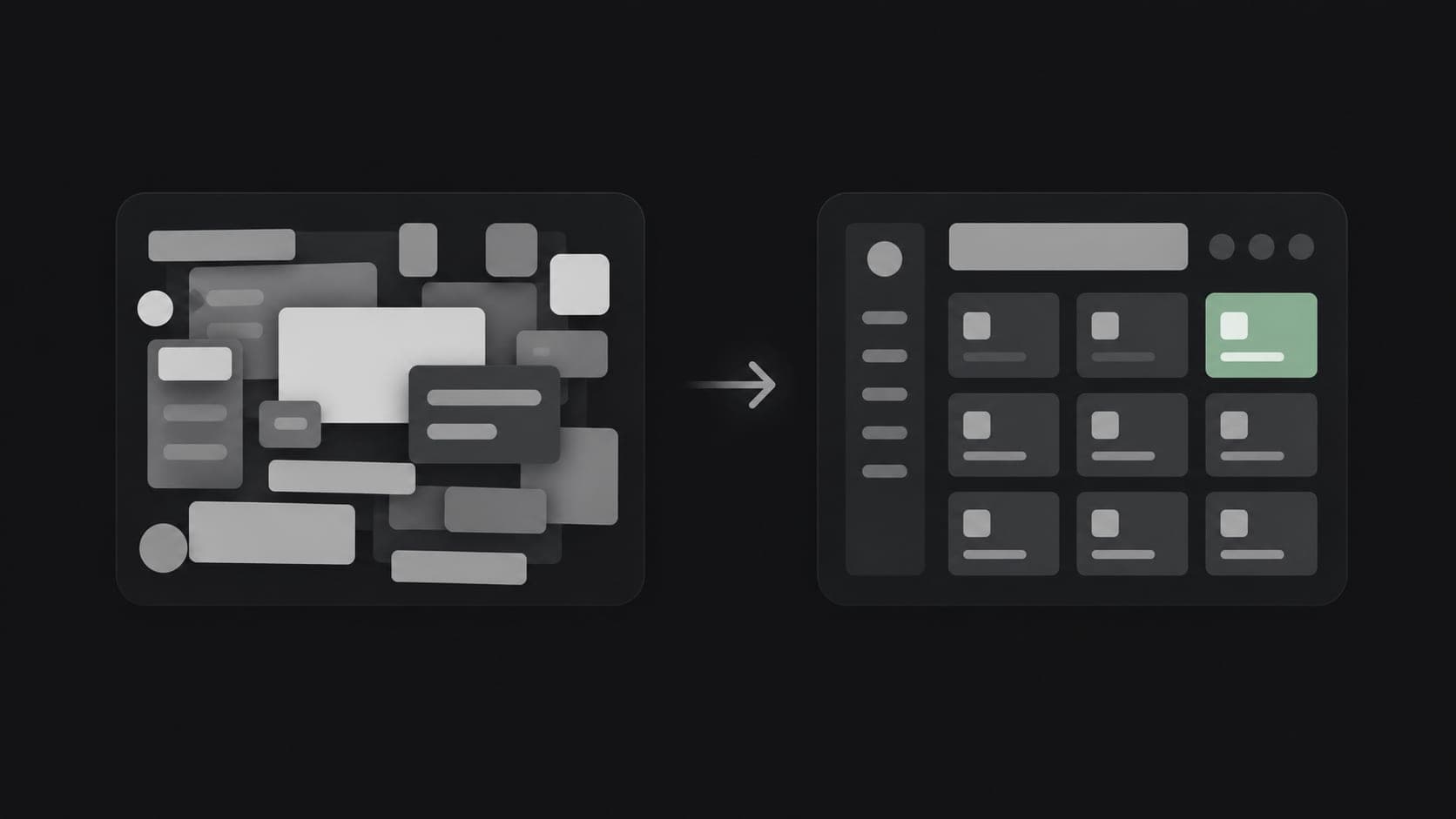
Design conversations tend to focus on customer-facing products — websites, apps, storefronts. Internal business software, the dashboards and admin panels staff use every day, often gets far less attention. That's backwards in one important way: the people using internal tools use them for hours, every day, for years. Poor usability there compounds daily in a way a customer's occasional visit to a website never does.
Confusing internal tools have a real, ongoing cost
When a dashboard is cluttered, when it's unclear where to find a specific function, or when completing a routine task takes more clicks than it should, that friction repeats every single time someone uses the system. Staff learn workarounds, avoid using certain features, or ask a colleague instead of figuring it out themselves. None of this shows up as a single dramatic failure — it shows up as a slow, steady tax on productivity.
Good UX is not about decoration
The most common misconception about UI/UX is that it's primarily visual. In business software, usability matters far more than aesthetics. A system that looks understated but lets someone complete a task in three clicks beats one that looks polished but buries that same task three menus deep. Design, in this context, means making the right action obvious and the wrong action hard to trigger by accident.
Onboarding time is a direct measure of UX quality
New staff learning an internal system quickly is a strong, practical signal of good design. If training a new hire on your business software takes days and requires a written manual to avoid mistakes, that's a usability problem, not a training problem. Well-designed internal tools should be largely self-evident to someone already familiar with the underlying task.
Errors caused by confusing interfaces are expensive
A dashboard that makes it easy to accidentally edit the wrong record, submit an incomplete order, or misread a report isn't just an inconvenience — it's a source of real operational mistakes. Careful interface design, particularly around confirmation steps and clear labeling for destructive actions, prevents errors before they happen rather than relying on staff to be careful indefinitely.
Consistency compounds across a growing system
As a business system grows — new modules, new reports, new user roles — a consistent design system keeps every new screen feeling familiar rather than like a separate tool bolted on. Without that consistency, each new feature adds a small new learning curve, and the system as a whole becomes harder to navigate over time rather than easier.
The practical takeaway
UI/UX investment in internal, business-facing software often pays back faster than the equivalent investment in a customer-facing product, precisely because internal tools are used so much more frequently, by people who have no choice but to use them. Treating dashboard and admin design as a genuine design problem — not an afterthought — tends to be one of the highest-return, least glamorous decisions in a software project.