
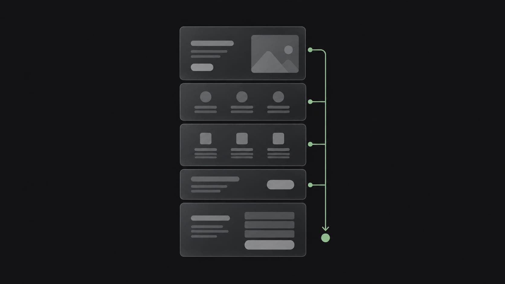
Businesses often assume a low enquiry rate is a design problem — the site needs to look more impressive. Sometimes that's true. More often, the real issue is structural: the site looks fine, but it makes it slightly too hard for a motivated visitor to actually take the next step. These are the features that tend to close that gap.
A visible, obvious way to make contact
This sounds obvious, but it's the single most common gap. Contact information buried in a footer, a contact page that's several clicks away, or a form with no clear call to action all quietly reduce enquiries. Every page that could reasonably lead to an enquiry should make the path to contact immediate and unmissable.
WhatsApp or direct messaging, where it fits the market
For many businesses, especially in regions where WhatsApp is the default way customers prefer to communicate, a simple click-to-chat link converts far better than a traditional contact form. It removes the friction of writing a formal message and waiting for a reply — the conversation just starts.
A form that asks only what's actually needed
Long forms with unnecessary fields lose people before submission. A form should ask exactly what's needed to have a useful first conversation — name, contact method, and a short description of what they need — and nothing more. Optional fields should stay optional, and it should be obvious which ones matter.
Clear, specific service pages instead of one vague page
A single "Services" page trying to describe everything at once tends to undersell each individual service. Dedicated pages for each core offering, explaining what it solves and who it's for, let visitors self-select into the right conversation instead of guessing whether you do what they need.
Fast load times, especially on mobile
Enquiry rates drop noticeably as load time increases, particularly for visitors arriving from a phone on average mobile data. This isn't a cosmetic performance metric — it directly affects how many people stay long enough to reach a contact point at all.
Social proof that's actually true
Real project examples, a clear explanation of process, and honest information about how the business works build more trust than generic claims like "industry leading" or "best in class." Visitors are increasingly good at recognizing filler language; specific, verifiable information earns more trust per word than broad claims ever will.
A clear next step after the enquiry
Confirming what happens after someone submits a form — "we'll respond within one business day" — reduces the anxiety of sending a message into a void. It's a small detail that measurably improves how many people follow through rather than abandoning the form halfway.
None of this requires a redesign
Most of these changes can be made to an existing site without rebuilding it from scratch. The point isn't to chase every trend — it's to remove the small, specific points of friction between a visitor's interest and an actual conversation.